Rangers City Connect Comes Correct
Finally a good alternate jersey in DFW
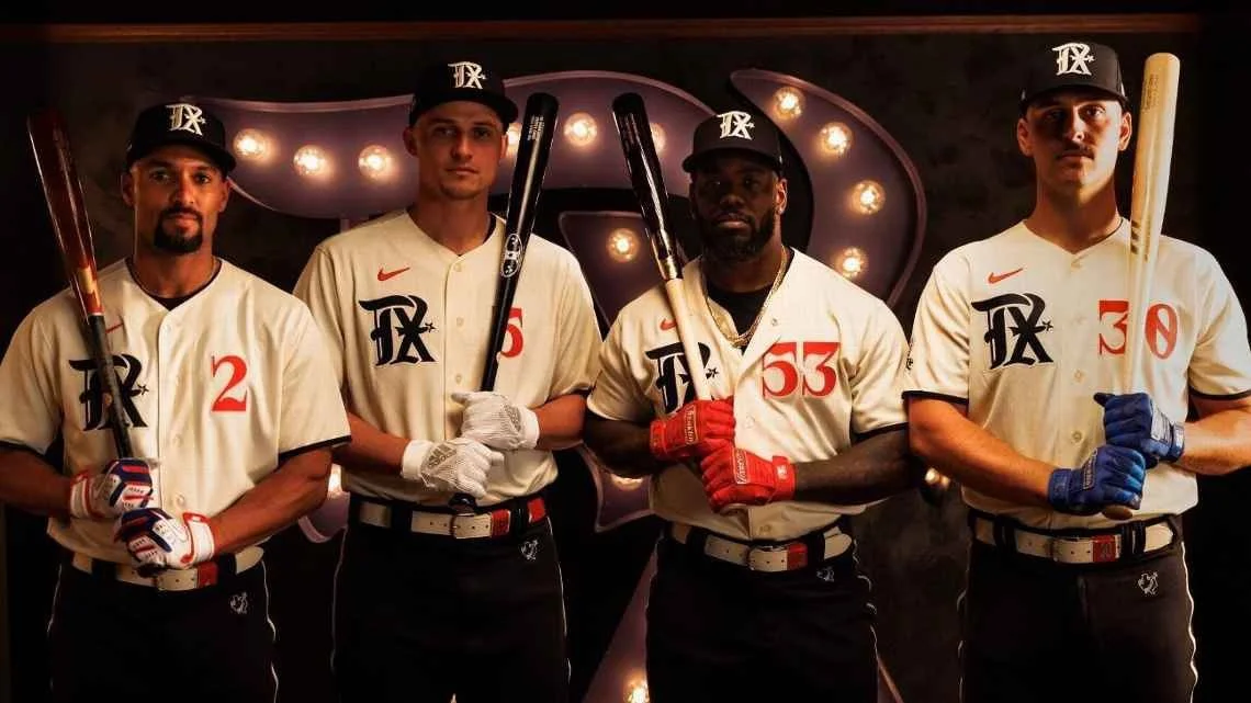
Last week, the Texas Rangers debuted the best alternate jersey in DFW history in the three main sports.
I don’t have room in my brain for hockey, but it seems the Dallas Stars get some honorable mentions.
Apologies to the Stars fans, I don’t watch hockey…I’m from Texas.
The Rangers nailed this jersey for two main reasons & there’s sports marketing principles we can learn from both.
Sports Marketing Principle # 1: Storytelling
Marketing is really all about Stories. It sounds obscure, but as more time passes, the more I see it as a simple truth.
As humans, we are the story making creature. It’s how we’ve processed & synthesized information for thousands of years.
One of my main appreciations for this uniform is that the storytelling is very deep. The Dallas Mavericks have some of the biggest misses in Alt Uniform history! Adding to this challenge is the lack of depth from their stories.
“We have an office in Deep Ellum, so this jersey is Spray Paint.”
”We have neon buildings, so we put a neon stripe on our uniform.”
A quick google search from a graphic designer should not lead to a full uniform design.
Marketing Principle 2: Authenticity
One of my biggest beefs with our local football team is that they claim Dallas while having no residence in our city. Their practice facility is in Frisco and they play in Arlington. They should really change their names to the Arlington Cowboys.
I really appreciate how the Rangers’ authenticity not not trying to own Dallas or Fort Worth while they play in Arlington. They embraced the fact that they’re a baseball team who bridge the gap between the two cities. I love this especially for our City (Dallas) who struggles with identity.
This identity crisis is a major reason why we started a project years ago called Dallas is Dallas to help rebrand our city.
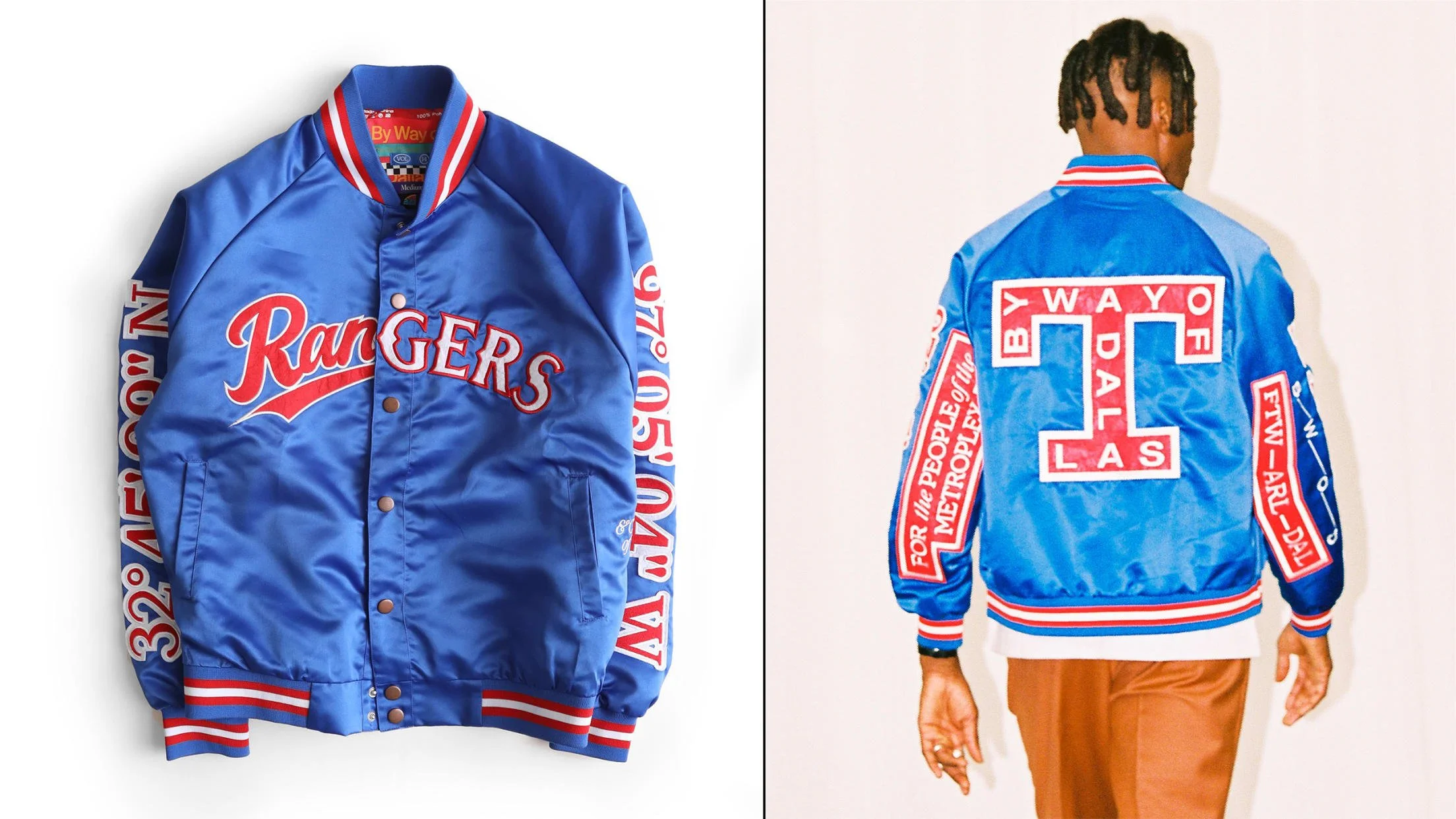
It evolved into By Way of Dallas and Hance Taplin has taken it to incredible heights. In fact, He and Trey teamed up for an incredible collaboration last season with the Rangers, and the team even featured them in the launch video.
This New Era ad showed up in my feed and left me asking all kinds of questions…
First, why do they have to add the Rangers official logo OVER this new City Connect logo? This is redundant and awkward.
I’m guessing it’s a licensing agreement where they can print these items, but they are required to include the official team mark. They should have passed on this altogether, because then someone had to create an ad and
a.) Photoshop the product onto this model
b.) Photoshop this model’s skin to look like a mannequin
Bizarre.
Can’t win’em all, especially when you leave your brand to partners, but we don’t have time for that one.
Thanks for reading!


